To comply with my NDA, sensitive and confidential information has been removed or disguised. All content represents my own work and does not necessarily reflect the views of Synopsys.
When a chip designer runs out of cloud credits,
the entire design pipeline stops.
Synopsys Cloud is the infrastructure backbone that powers modern chip design. It combines advanced compute and storage with unlimited on-demand access to EDA software licenses, giving chip designers the ability to run complex simulations, synthesis, and verification workloads without managing physical hardware.
But behind every engineer running workloads is a Cloud Admin carrying the weight of budget governance. They are responsible for allocating cloud credits across teams, monitoring consumption in real time, preventing quota overruns, and ensuring that the compute costs of a multi-million-dollar chip design program stay within bounds. This is not a convenience problem, it is a mission-critical operational responsibility.
"Managing cloud credits for an EDA organisation is like managing fuel for a fleet of aircraft mid-flight. You cannot stop. You cannot guess. And running out is not an option."
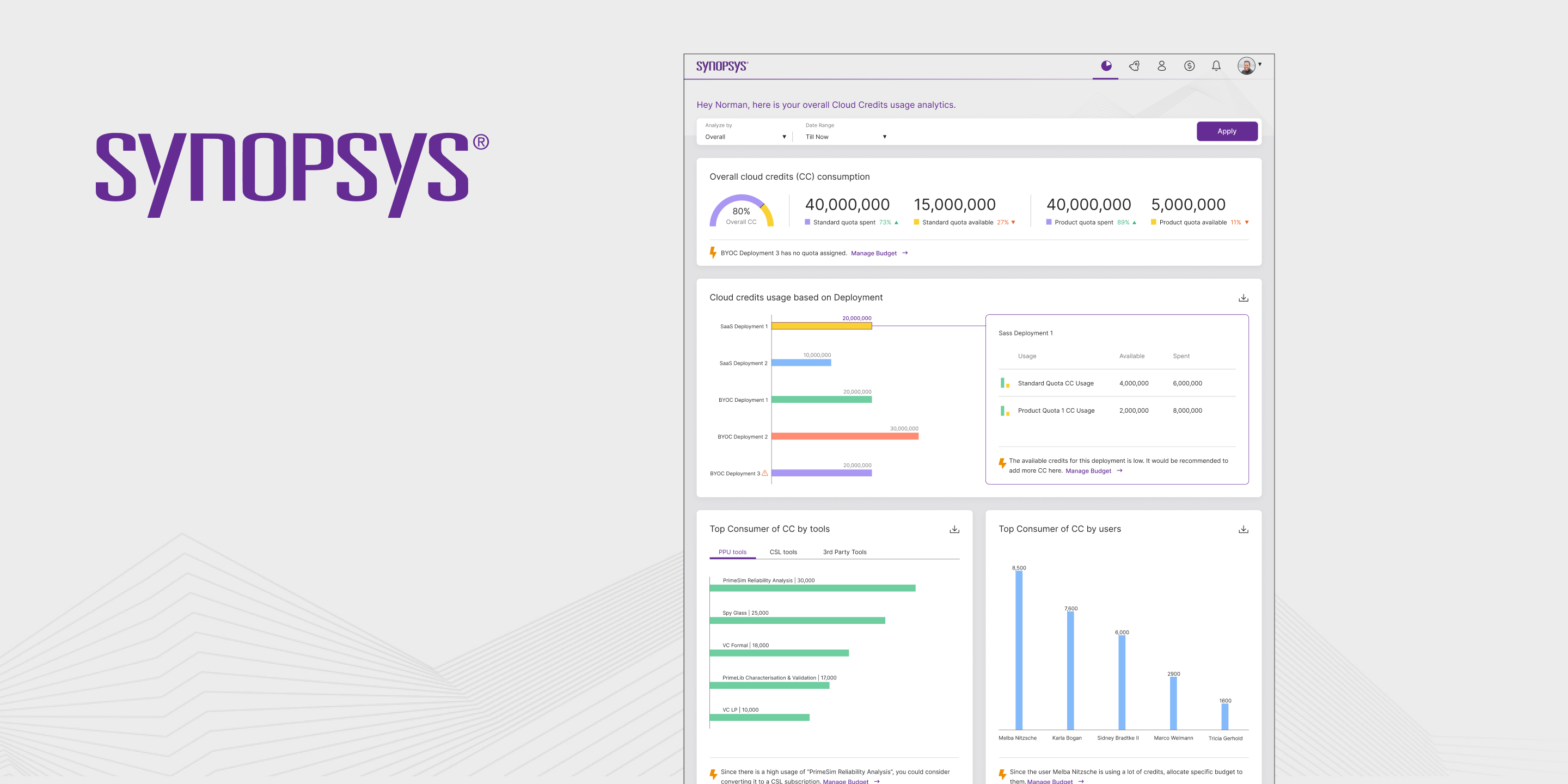
The existing Synopsys Cloud interface gave admins data, but not intelligence. They could see numbers, but the numbers did not speak. They could find information, but only if they already knew where to look. In a domain where decisions happen under pressure and errors compound instantly, that gap between data and understanding was costing organisations real money.
Three roles. One platform. Completely different needs.
The first design decision was to resist the temptation of building for everyone at once. Understanding who actually uses a cloud governance platform, and what failure looks like for each of them, was the foundation everything else was built on.
The most important discovery from the persona work: all three users were asking the same underlying question, "What is happening to my credits?", but from three completely different angles, at three completely different levels of detail. The design challenge was not to build three separate interfaces. It was to build one interface that answered the question correctly depending on who was asking.
Data without hierarchy is just noise with a dashboard skin.
The core design challenge on this project was not visual, it was cognitive. How do you take a system with dozens of data points across multiple dimensions (time, team, project, quota type, consumption rate) and surface the information that is actually actionable at any given moment?
The existing platform committed the most common enterprise UX failure: it displayed everything equally. Every metric had the same visual weight. Every chart was the same size. Every data point competed for attention. The result was a dashboard that required users to bring their own intelligence to interpret, when the entire point of a dashboard is to reduce the intelligence required.
The redesign approach was built around a single principle: answers before questions. Before a user formulates a question, the interface should have already surfaced the answer. The mental model shift was from "here is all the data" to "here is what you need to know right now, and here is everything else if you need it."
Three layers of intelligence.
One coherent system.
The redesign was structured around three progressive layers of information, each one answering a different cognitive job that the Cloud Admin needs to complete during their working day.
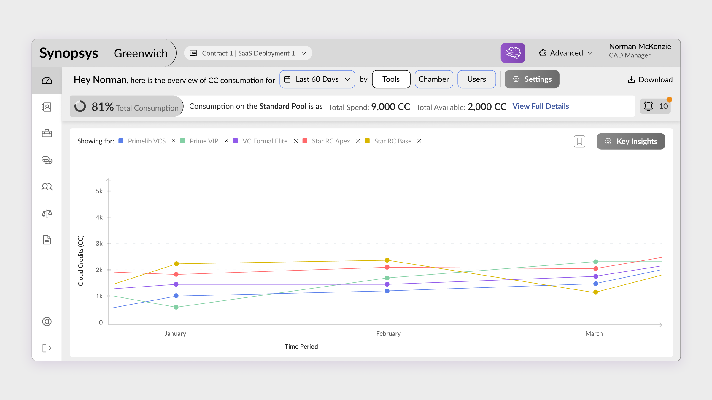
AI-Enabled Dashboard, The Situation at a Glance
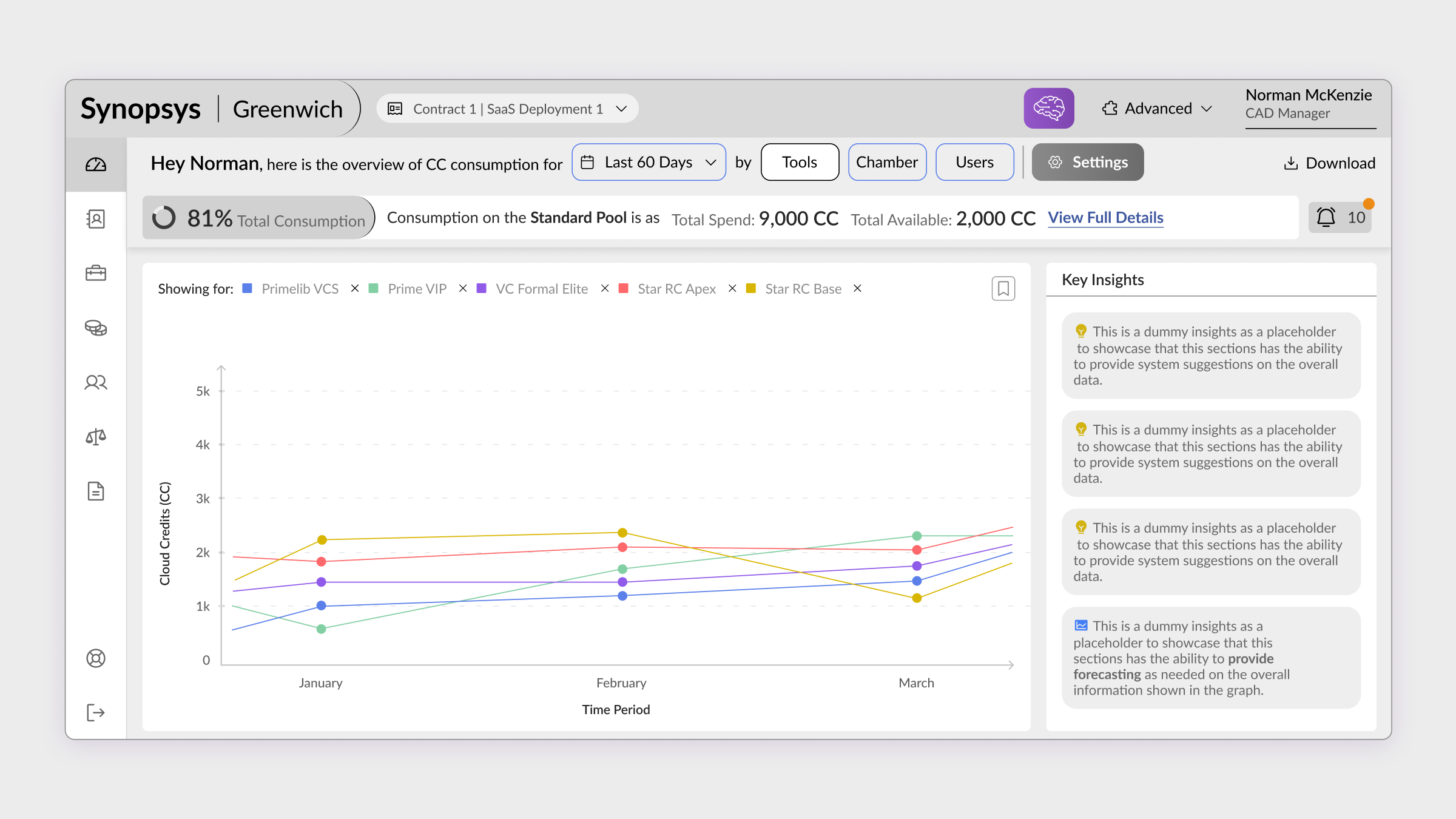
The dashboard was redesigned as a command centre, not a report. The first thing a Cloud Admin sees is the answer to the question they haven't asked yet: are we on track? A real-time credit consumption overview, burn rate trend, quota utilisation across teams, and an AI-generated summary of anomalies, all surfaced before the admin has had to click anything.
The AI layer was designed to do one job: surface the signal from the noise. Instead of showing all consumption data, it identified patterns, teams consuming unusually fast, projects approaching quota thresholds, jobs running longer than historical averages, and pushed those patterns to the top of the interface. The admin's first decision each morning stopped being "what should I look at?" and became "what do I do about this?"
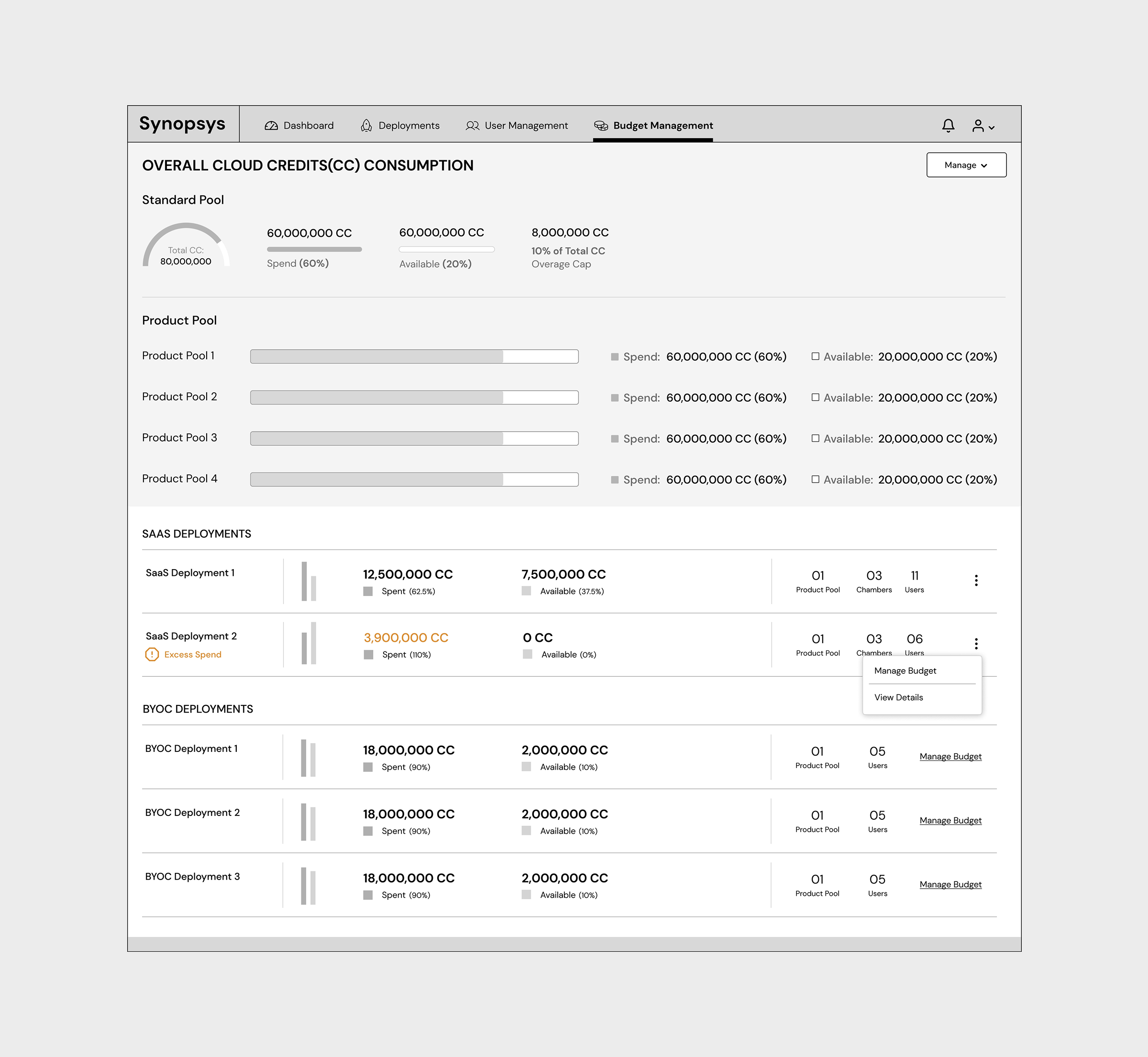
Budget Management, Control Without Complexity
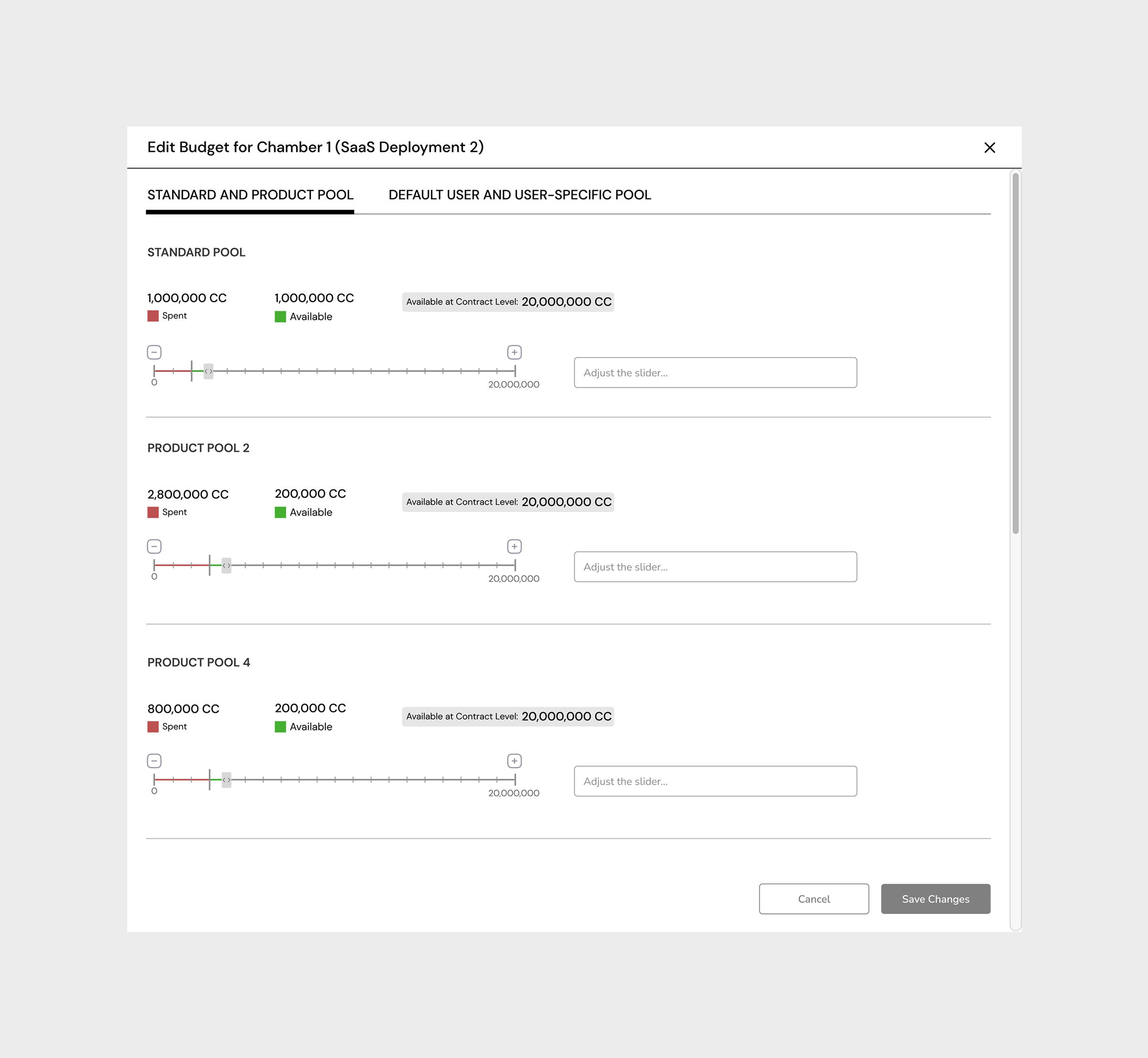
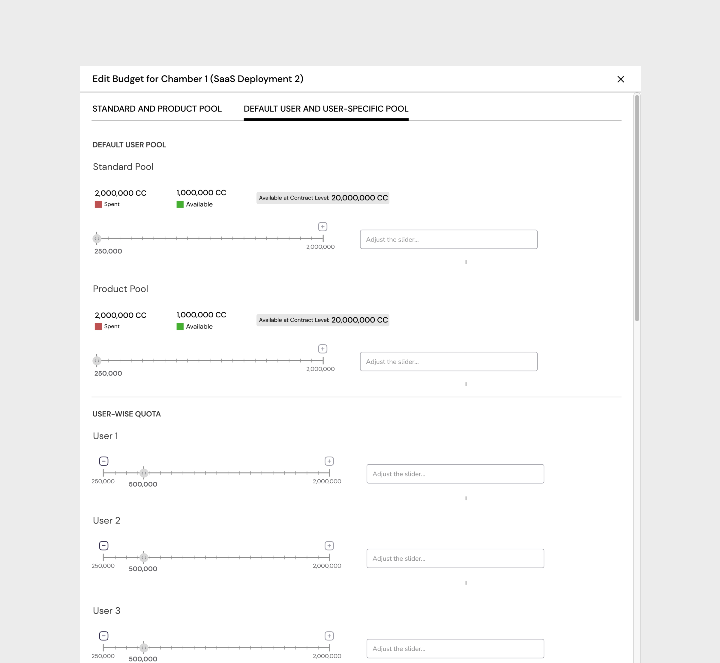
Budget governance is where the stakes are highest, and where the existing interface was most broken. Reallocating credits between teams, setting quota limits, adjusting allocation rules, these are decisions that happen under pressure, often when something has already gone wrong. The redesign made these actions direct, predictable, and reversible.
The budget management screens were built around the admin's decision-making flow: see the current state, understand the gap, take action, confirm the impact. Every allocation decision was previewed before it was committed, with projected impact shown in real time. The goal was not to simplify the complexity of cloud budget management, it was to make the complexity legible.
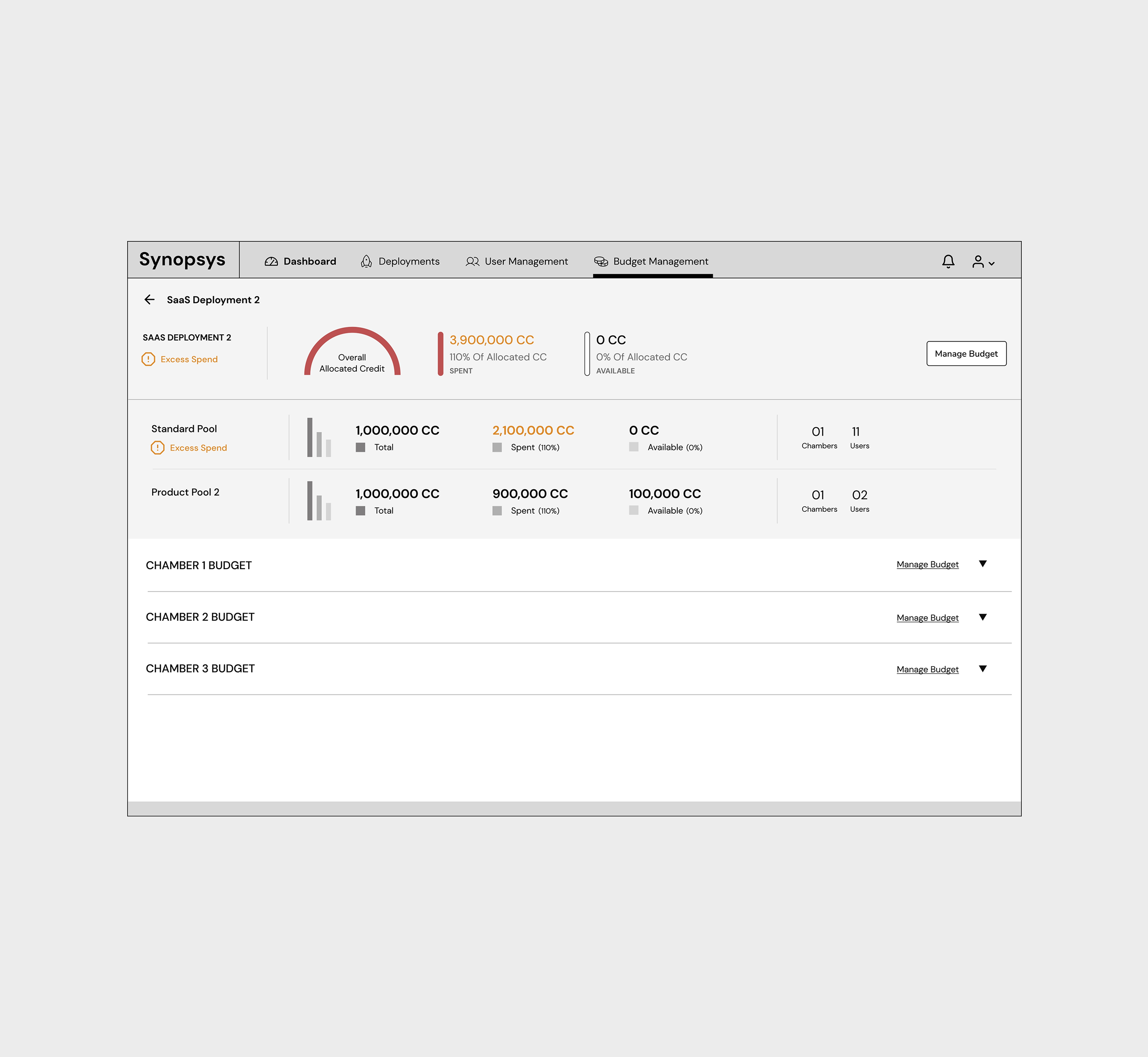
Contextual Filtering, From Organisation to Individual
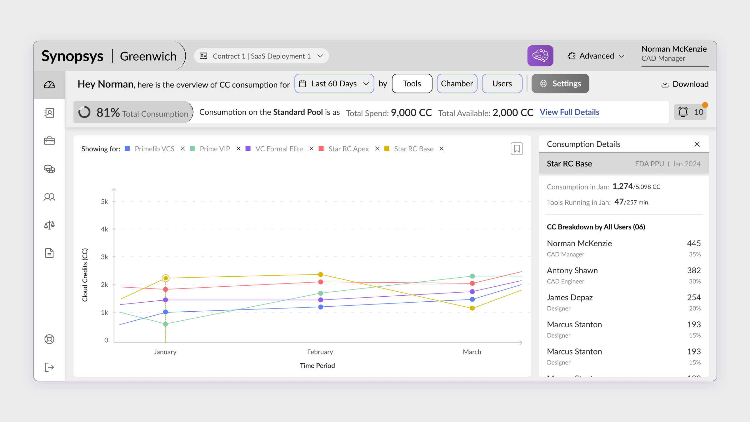
The third layer of the system was navigation intelligence. Cloud credit consumption is inherently hierarchical, organisation → team → project → job → individual run. The redesign introduced a contextual filtering system that let admins drill from any level to any other level without losing context about where they started.
Critically, every drill-down preserved the anomaly signals from the layer above. If the AI dashboard flagged a team as over-consuming, clicking into that team's view maintained the highlight, so the admin always knew which anomaly they were investigating, and could trace it all the way to the individual job that triggered it.
From reactive firefighting
to proactive governance.
The redesign delivered three fundamental shifts in how Cloud Admins experienced their role, moving from a position of constant catch-up to one of genuine control.
Contextual guidance gave admins direct access to functionality they previously had to search for, reducing time-to-action on critical governance tasks.
Data-driven insights for resource allocation replaced reactive firefighting. Admins could now act on budget issues before they became overruns.
Smart insights focusing on credit usage with root cause analysis moved the product from data display to decision support, a fundamentally different product category.
Enterprise admin interfaces fail when they confuse "showing all the data" with "providing intelligence." The real design challenge was not visualising consumption, it was answering the question behind the question. What does this number mean? What should I do about it? Is this normal or is this a problem? Designing for the decision, not the metric, is what separates a dashboard from a tool.
What building for EDA taught me about designing for expertise.
Designing for expert users in a high-stakes domain requires a different kind of humility. The temptation is always to simplify, to reduce complexity, to abstract away detail, to make things "easier." But Cloud Admins are not intimidated by complexity. They are intimidated by uncertainty.
The distinction matters enormously. Simplification removes features. Clarity removes doubt. This project was an exercise in radical clarity, keeping all the depth that power users need while removing every moment of unnecessary cognitive effort required to access it.
The second lesson: AI is most valuable not when it replaces human judgment, but when it restores human attention. The AI layer in this dashboard did not make decisions. It directed attention, surfacing the one thing out of fifty that actually needed looking at. That is the highest-value application of AI in enterprise UX.
"The goal was not to make cloud credit management simple. It was to make it legible. There is a difference, and that difference is everything."
To comply with my NDA, sensitive or confidential information has been removed and disguised. All information is my own and does not necessarily reflect the views of Synopsys. Want to know more? Let's get on a call →
Want to discuss this further?