To comply with my NDA, sensitive and confidential information has been removed or disguised. All content represents my own work and does not necessarily reflect the views of CyePro Solutions.
Every morning, a sales manager opened 13 Excel files
to understand what happened yesterday.
CyePro is a cutting-edge automotive sales management platform designed to streamline dealership operations and optimise sales processes for OEMs and their dealer networks. Before CyePro existed as a product, it existed as a collection of spreadsheets, 13 of them, each tracking a different slice of the sales operation, none of them talking to each other.
Sales managers at dealerships would open their morning with a ritual: load the pipeline sheet, cross-reference with the inventory sheet, check the leads sheet, pull the regional performance file, compare against the target sheet. This was not analysis. This was archaeology, digging through layers of disconnected data to reconstruct a picture that should have been immediately visible.
"The data existed. The intelligence did not. Everything a sales manager needed to make a good decision was already captured somewhere in those 13 files, it just required a full morning's work to assemble it."
The problem ran deeper than inconvenience. When decision-making requires that much manual assembly, decisions get delayed. Delayed decisions in automotive sales mean missed opportunities, a lead that went cold, a quota that was hit too late, a region that underperformed for a month before anyone noticed. The cost of fragmented data is not just time. It is competitive disadvantage.
Three roles. Three completely different definitions of what matters.
The first step was not designing dashboards. It was understanding what questions each user needed answered, and how urgently. The mental models of an OEM executive, a regional head, and a dealership sales manager are fundamentally different, even when they are looking at the same underlying data.
The insight that shaped the entire architecture: all three users needed the same data, but at different altitudes. The OEM executive needed to see the forest. The regional head needed to see the trees. The sales manager needed to see the leaves. One platform had to serve all three without making any of them feel like they were using a tool designed for someone else.
If the users live inside cars,
the interface should feel like one.
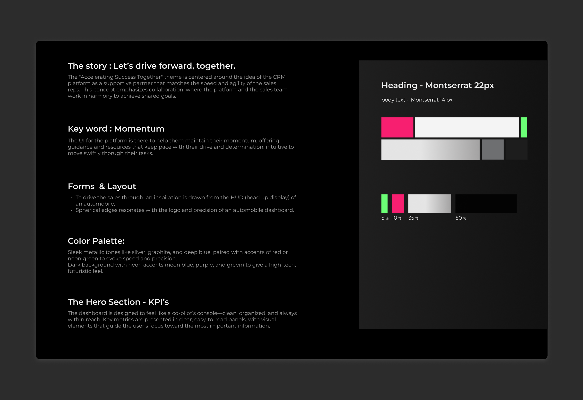
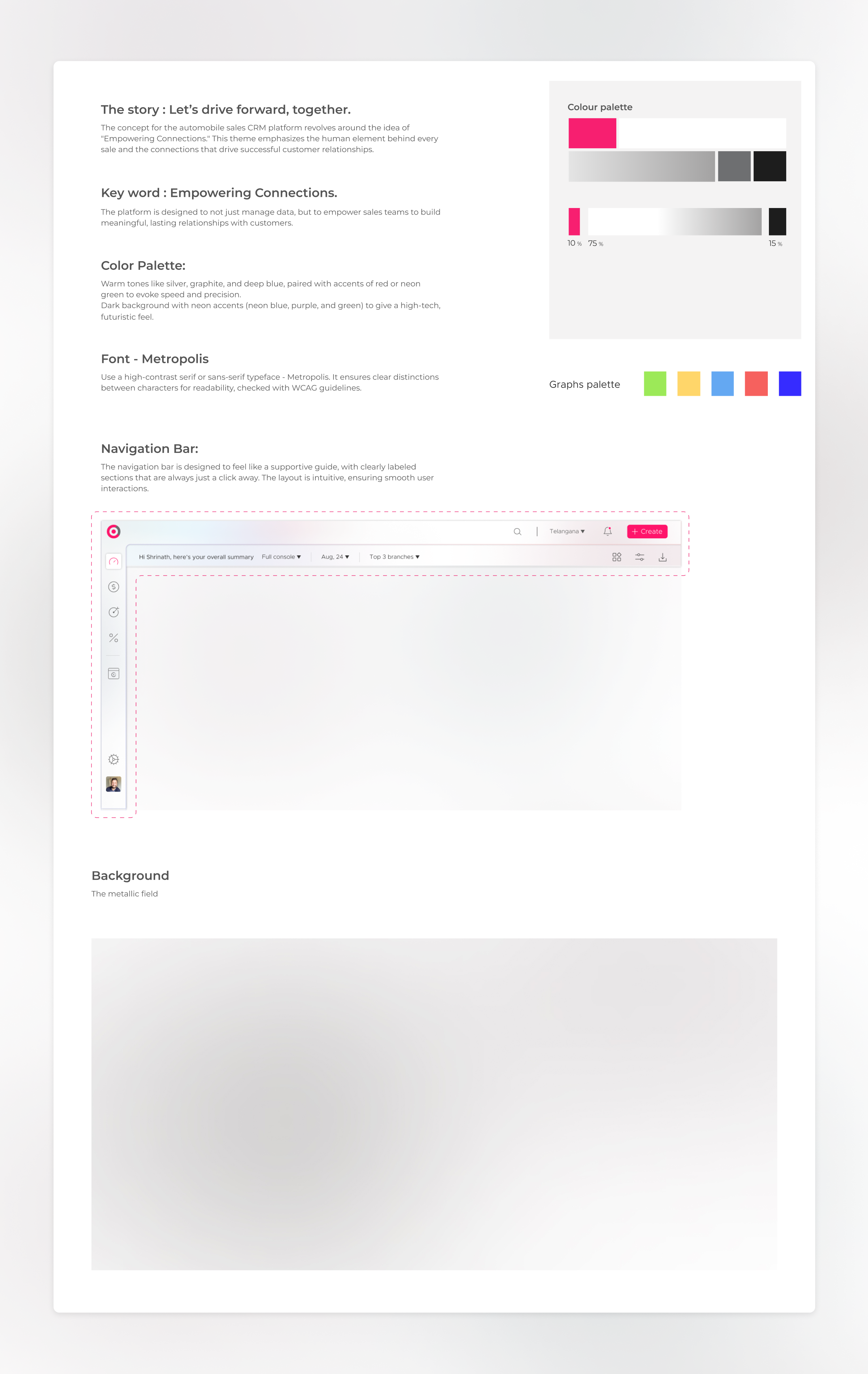
This was the team's idea, and it was the right one. Automotive sales professionals spend their professional lives surrounded by cars. They think in gauges, dials, and performance indicators. They read a rev counter faster than a bar chart. The decision to borrow the visual language of the car dashboard was not a stylistic choice. It was a mental model transfer.
The goal was zero learning curve. A sales manager who had never used CyePro before should be able to open the platform and immediately understand what they were looking at, because the interface would speak in a language they already knew fluently. Gauges for performance indicators. Speed-inspired typography for numbers. Dark cockpit aesthetics available alongside a clean light mode. The platform should feel like it belonged to the automotive world, not like another generic enterprise SaaS tool that had been dropped into it.
Both light and dark themes were designed, giving users the flexibility to match their environment and preference while maintaining full data clarity in both modes.
"The best interface for any domain is one that borrows the visual vocabulary its users already trust. We didn't need to teach anyone how to read a gauge. They already knew."
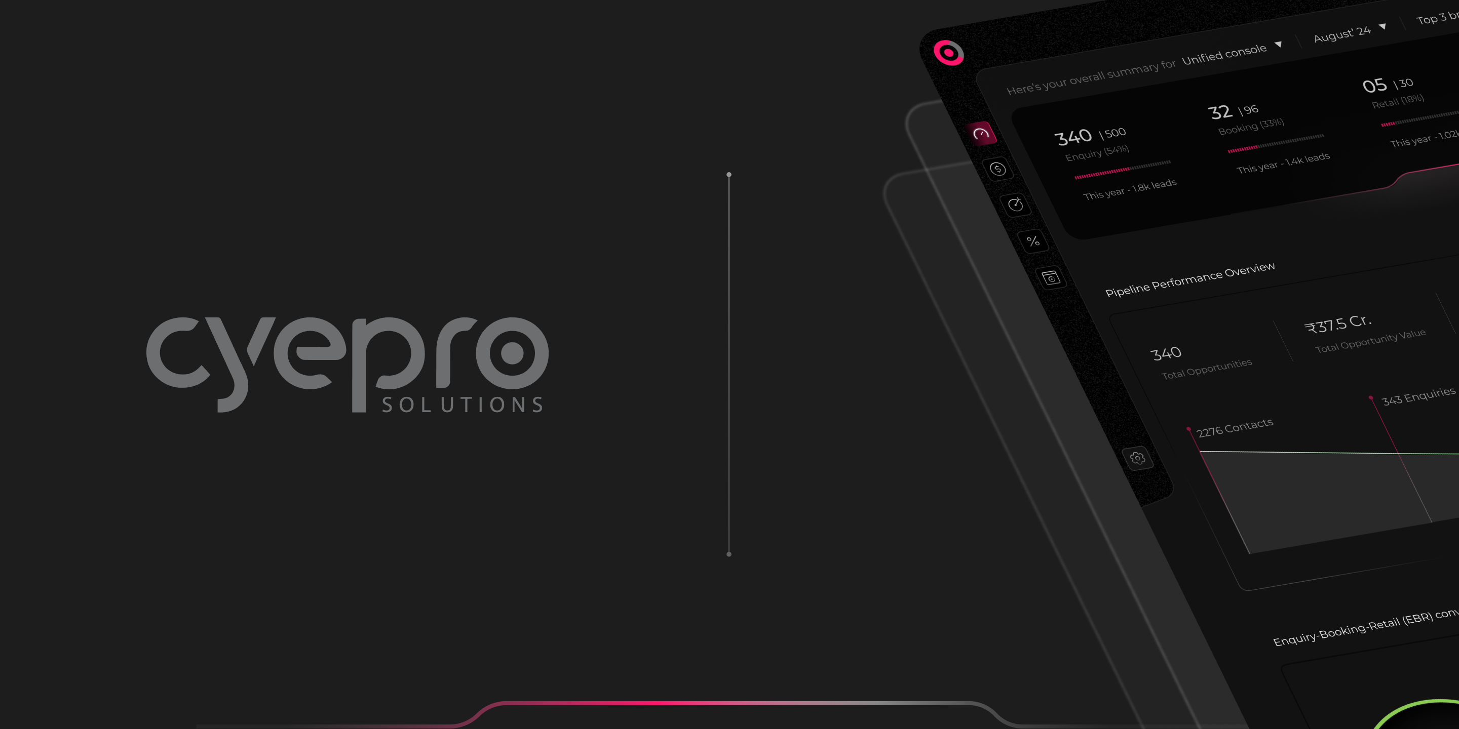
13 sheets. 5 consoles.
One unified system.
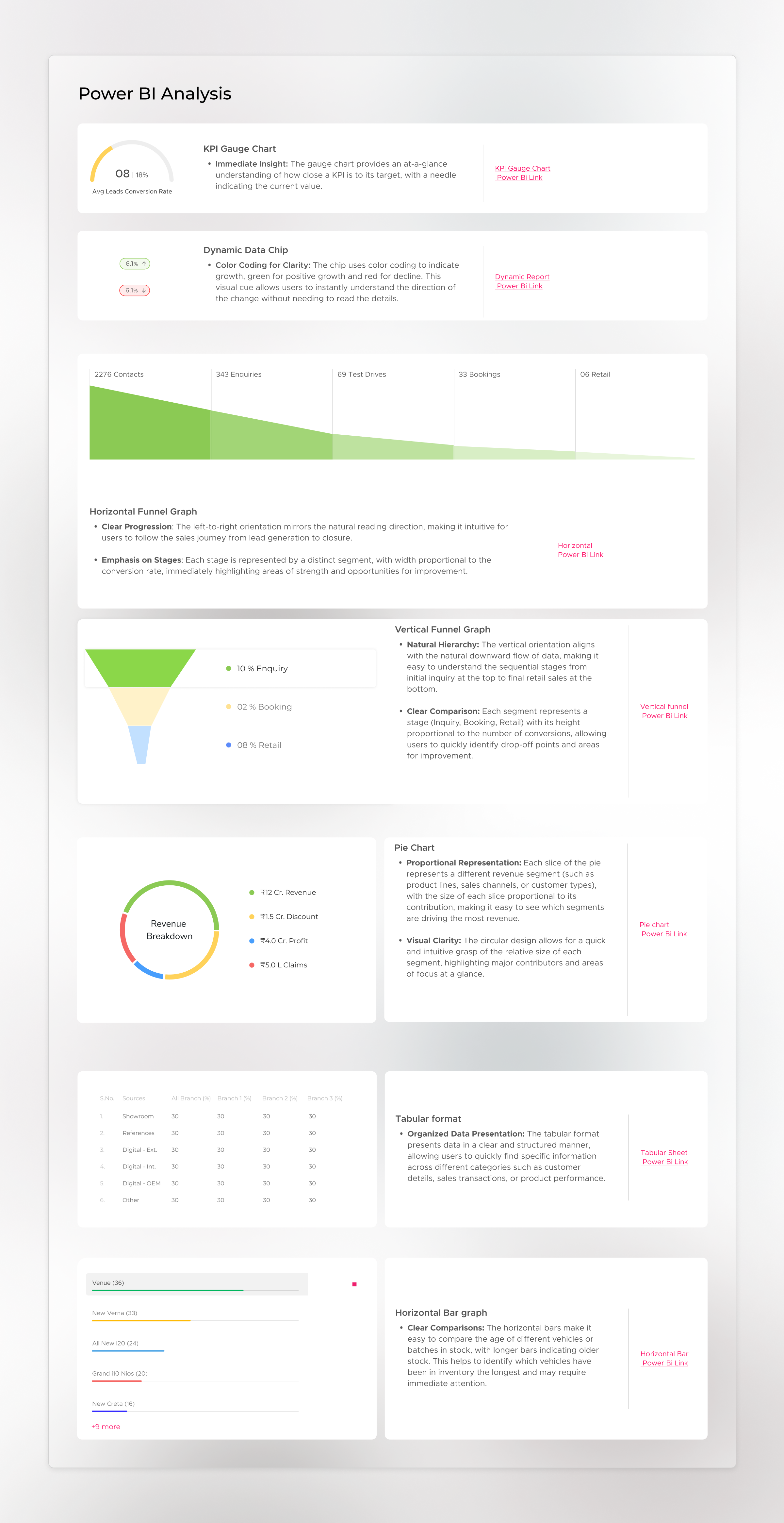
The compression of 13 Excel sheets into 5 intelligent dashboards was not a reduction in information, it was a reorganisation of it. Every data point from the original files was preserved. What changed was its context, its hierarchy, and its relationship to every other data point. The result was five purpose-built consoles, each designed for a specific cognitive job.
Unified Console, The Complete Picture at a Glance
The Unified Console was designed to answer the question every manager asks when they first open their laptop in the morning: how are we doing? It brings together pipeline health, sales performance, regional comparison, and target tracking into a single command-centre view, available in both light and dark themes to suit different working environments and presentation contexts.
The car dashboard aesthetic is most visible here, performance indicators rendered as gauges, key metrics displayed with the visual weight of a cockpit readout, critical alerts surfaced with the same urgency as a warning light. The goal was for a manager to absorb the day's situation in under 30 seconds.
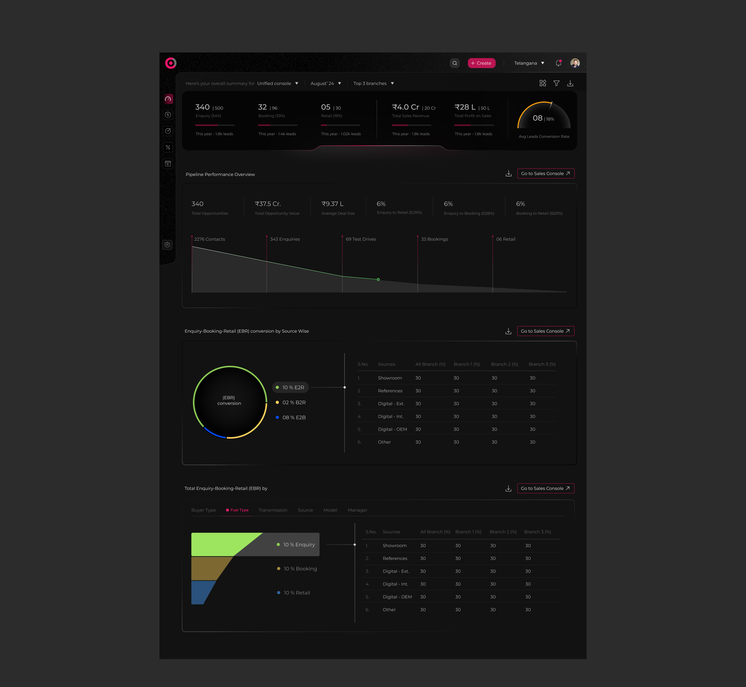
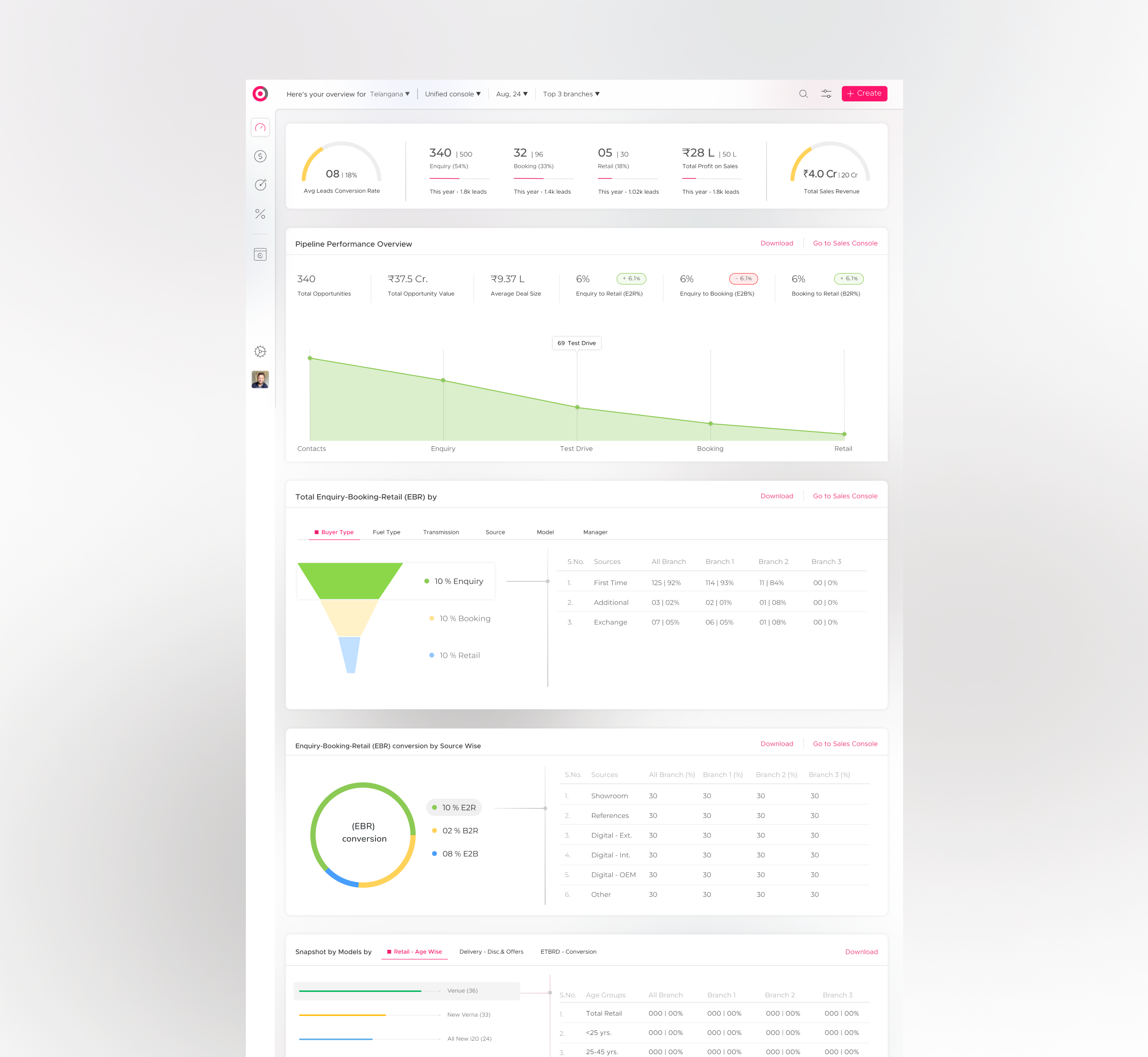
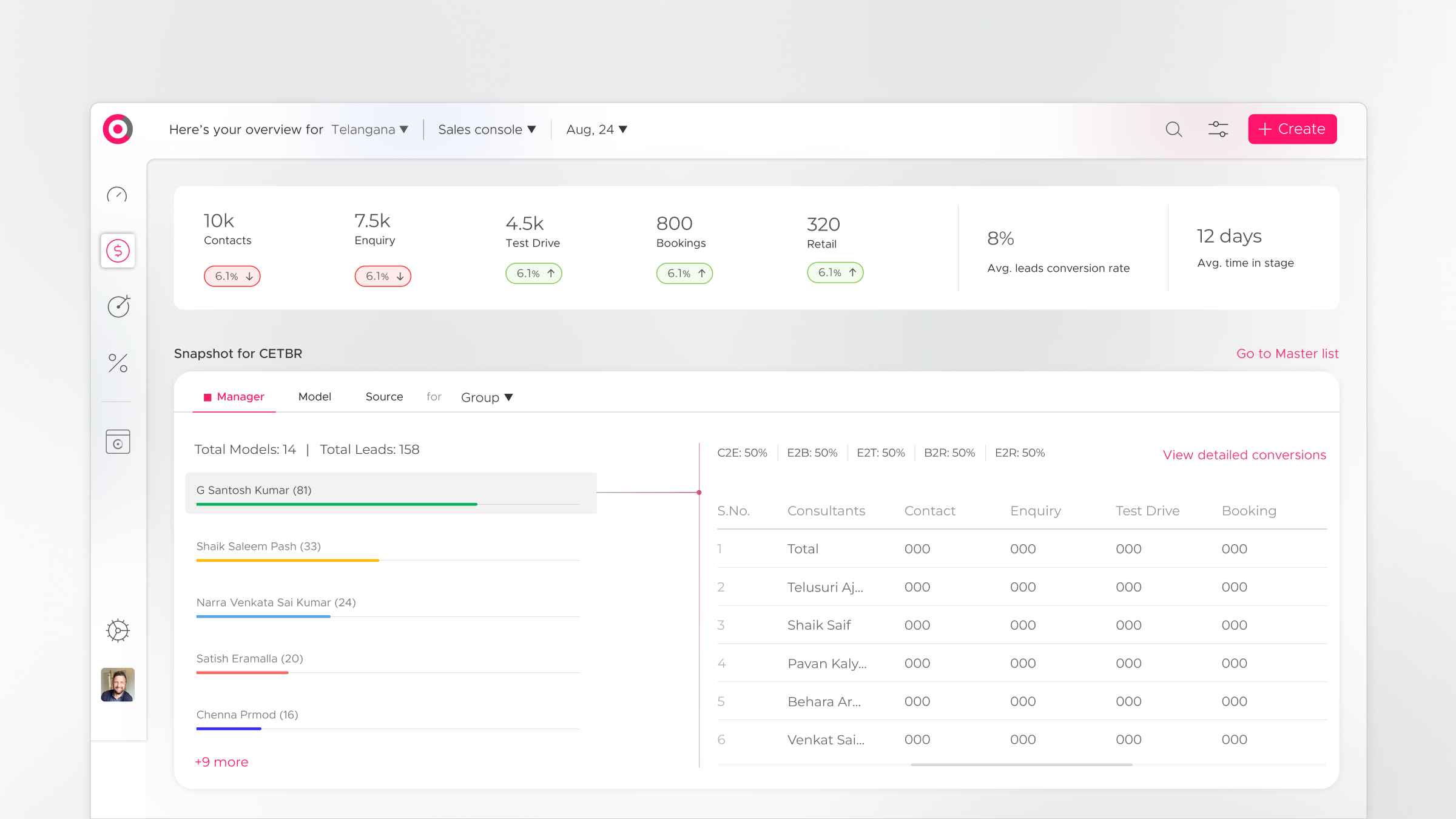
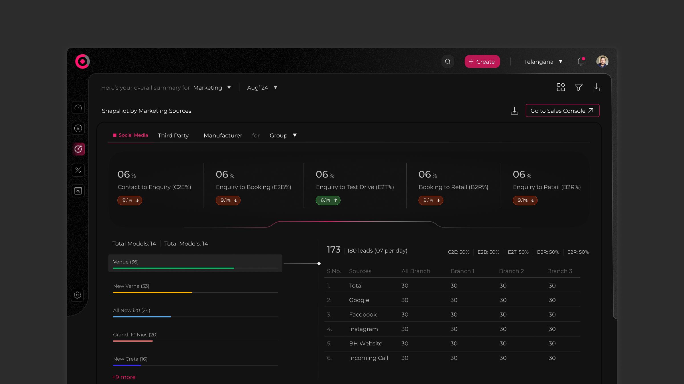
Sales Console, Pipeline Intelligence
The Sales Console was designed for the dealership sales manager's daily workflow, tracking leads, monitoring conversion rates, managing follow-up queues, and measuring individual salesperson performance against targets. What had previously required cross-referencing three separate Excel files was now a single, live view with drill-down capability at every level.
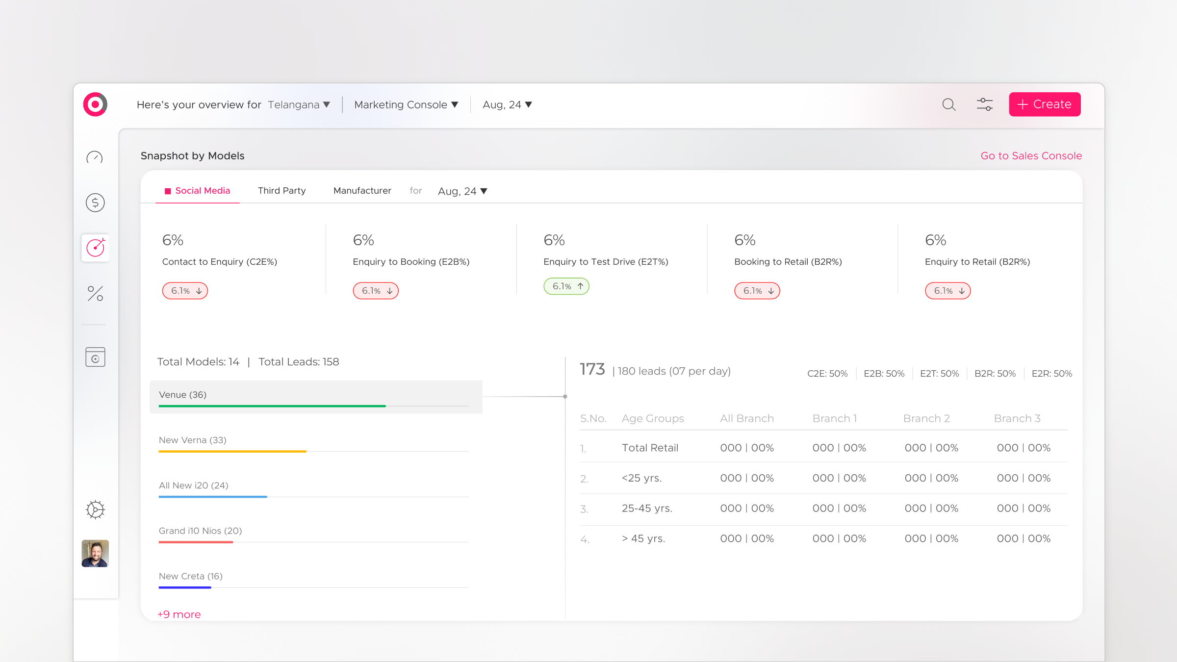
Marketing Console, Lead Source & Campaign Performance
The Marketing Console gave OEM and regional marketing teams visibility into where leads were coming from, which campaigns were converting, and where marketing spend was generating the best pipeline. This data had previously lived entirely in separate reporting files, invisible to the sales operation until a monthly review meeting.
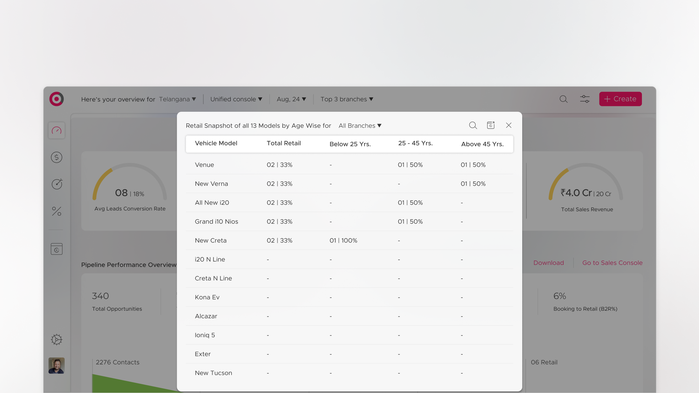
Retail Snapshot, Regional Performance at a Glance
The Retail Snapshot was designed for the regional head's morning review, a compressed, high-density view of all dealerships in the region, ranked by performance against quota. It answered the question that regional heads needed answered before any other: which dealerships need my attention today?
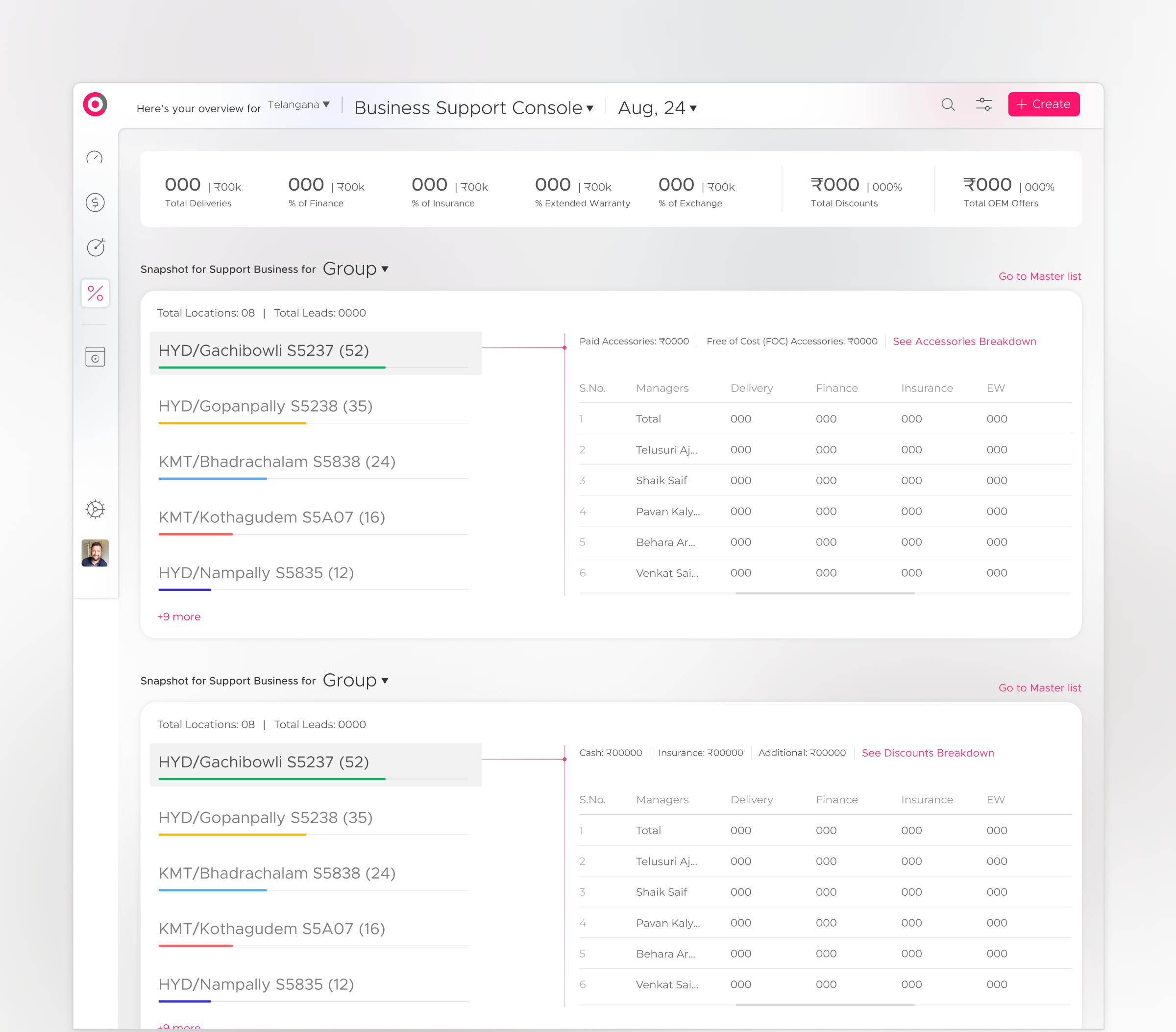
Business Support Console & Mastersheet, Operational Depth
The Business Support Console handled the operational layer, warranty, service, customer satisfaction, and post-sale data that informed long-term customer relationship management. The Mastersheet preserved the raw data accessibility that Excel-native users depended on, but within the structured CyePro environment, ensuring the transition from spreadsheet to system felt evolutionary, not disruptive.

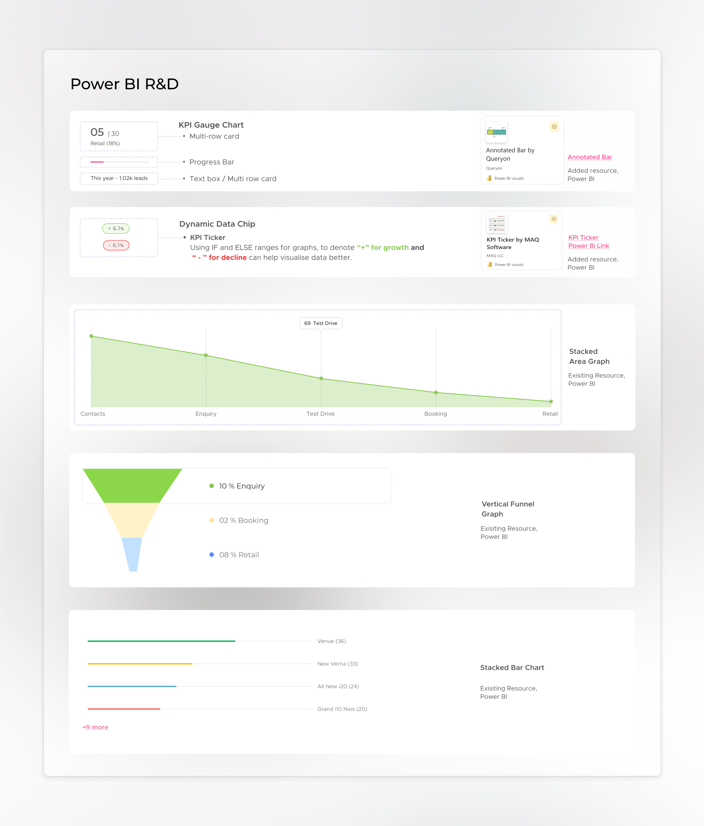
Design within constraints is still design.
CyePro was built on Power BI, a constraint that shaped every design decision. Working within a reporting platform's visual framework while still delivering automotive-native aesthetics required a deep understanding of what Power BI could and could not do, and a significant amount of creative problem-solving to make the result feel intentional rather than constrained.
The Power BI research phase produced two key documents that mapped the platform's capabilities and limitations against the design requirements. Every visual element, the gauge-style indicators, the dark theme, the typography treatment, the colour system, was tested for Power BI compatibility before it was committed to the design. The result was a platform that looked nothing like a standard Power BI report, which was exactly the point.
Data that was locked in spreadsheets
became intelligence that drove decisions.
Thirteen fragmented Excel sheets compressed into five purpose-built, intelligent consoles, without losing a single data point.
The car dashboard visual language enabled instant comprehension for automotive professionals, the interface spoke their language from the first screen.
Large datasets summarised into meaningful graphs and trend indicators, enabling rapid comprehension of sales performance and pipeline health.
Proposed AI integration for root cause analysis gave managers the ability to identify pipeline issues at source, not just observe their downstream effects.
A creative and functional solution delivered within Power BI's constraints, proving that platform limitations do not have to mean design limitations.
The hardest part of this project was not the data visualisation, it was the data empathy. Understanding not just what the numbers meant, but what it felt like to be a sales manager who had been living inside spreadsheets for years, and what it would feel like for that person to open CyePro for the first time. The design had to be worth the switch. It had to feel like an upgrade, not just a replacement.
What CyePro taught me about designing for domain fluency.
Domain-native design is the highest form of UX work. It is not enough to understand information architecture and visual hierarchy, you have to understand the world your users live in, the vocabulary they use, the mental models they carry, and the shortcuts their brains have already built. Then you build toward those shortcuts, not against them.
The second lesson: constraints are creative catalysts. The Power BI limitation forced a level of design precision that a more flexible environment might not have demanded. Every design decision had to survive a compatibility test, which meant every design decision had to be intentional. The result was a more rigorous, more considered visual system than the brief originally required.
The third lesson, and the most important: data visualisation is not about charts. It is about cognitive load reduction. The question is never "how do I display this data?" The question is always "what does the user need to understand, and what is the fastest path from data to understanding?" Those are different questions with very different answers.
"The best thing a dashboard can do is make a good decision feel obvious. Not easy, obvious. There is a difference. Obvious means the data is arranged in such a way that the right conclusion arrives before you have had to think about it."
To comply with my NDA, sensitive or confidential information has been removed and disguised. All information is my own and does not necessarily reflect the views of CyePro Solutions. Want to know more? Let's get on a call →
Want to discuss this further?